Branding for Aurality
Aurality is a pioneering hardware company at the forefront of the audio revolution. They develop exceptional audio hardware with cutting-edge audio technology, redefining the way people experience sound. From AI-powered noise cancellation to immersive audio experiences, Aurality is passionate about creating personalized, engaging, and transformative soundscapes.
The Brief
Design a premium and sophisticated branding package for an innovative audio pioneer, with a strong emphasis on high-quality sound and sophistication. The primary target audience consists of tech-savvy consumers aged 30 to 45 who are actively seeking high-fidelity audio experiences. This group includes early adopters of cutting-edge technologies, as well as content creators who prioritize exceptional audio quality in their work. Additionally, the secondary audience encompasses audiophiles and passionate music enthusiasts who seek immersive audio experiences, along with professionals such as musicians and producers who depend on high-quality sound for their craft.
Tools used
Adobe Illustrator for graphic illustrations and concepts, Adobe Photoshop for real-world branding mockups
Note
Each of the below images within the gallery are expandable with a click. Below the gallery, you’ll find further details on the creative process behind the logo.


The Logo

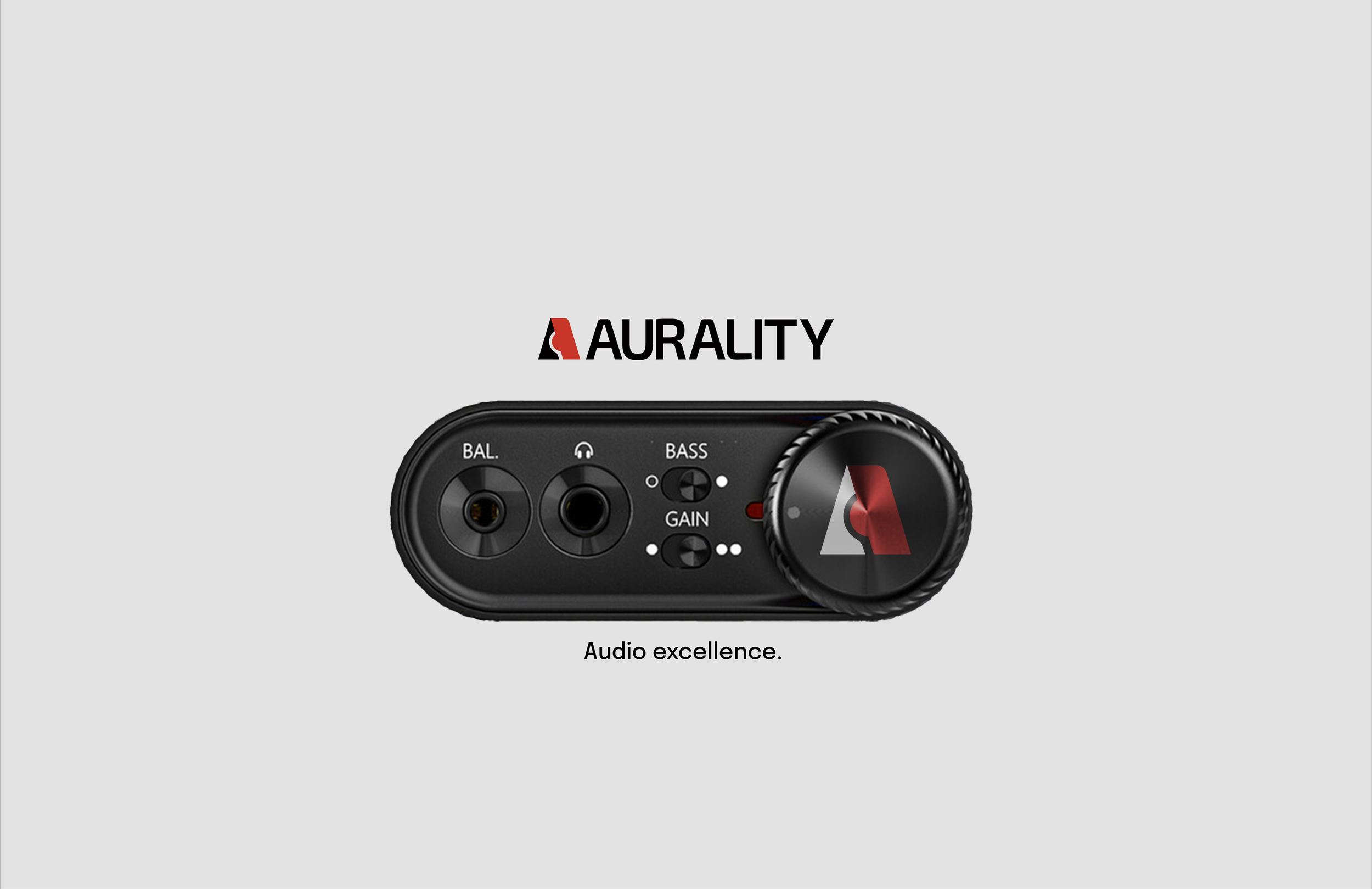
The inspiration for the Auralitiy logo is closely drawn from various elements of audio equipment commonly found within a modern recording studio. More specifically, the logo’s center crossbar is circular in shape and is intentionally designed to resemble both a microphone and an index finger gesturing toward a “record” button. This dual representation aims to evoke the creative process of recording sound. Additionally, the left stem leading up to the apex of the letter “A” is crafted to symbolize audio input, which is further emphasized by the contrasting color choice used in the design.
The Logo Concepts

The logo started as a geometric, cube-like design meant to look like an audio rack with stacked equipment. During development, I noticed a corner that looked like a slanted letter “A,” which inspired me to explore this idea further.
In creating variation 2, I aimed to design a 2.5D logo that paired well with the type. I started experimenting with the letter "A," shown with green outlines to highlight the parts of the logo that changed during the creative process.
By variation 3, The rounded corner inspired me greatly because the logo, with its previous design, seemed too sharp and lacked approachability.
With variation 5, I took away the gray background because it made the logo too dark. I added a thinner line to the “A” stem and included a red circle for the crossbar.
The circle quickly became a widely recognized representation for two very important aspects of audio production and studio quotient: the process of recording and the overall quality of the sound captured.
By variation 6, you’ll see that I incorporated a carefully smoothed edge which gives the overall impression of a microphone, enhancing the design's visual appeal. As previously mentioned, the right slant of the letter A was changed to harmonize with the red circular crossbar, and this adjustment came to represent an index finger pressing the “record” button, symbolizing the act of capturing sound or moments.