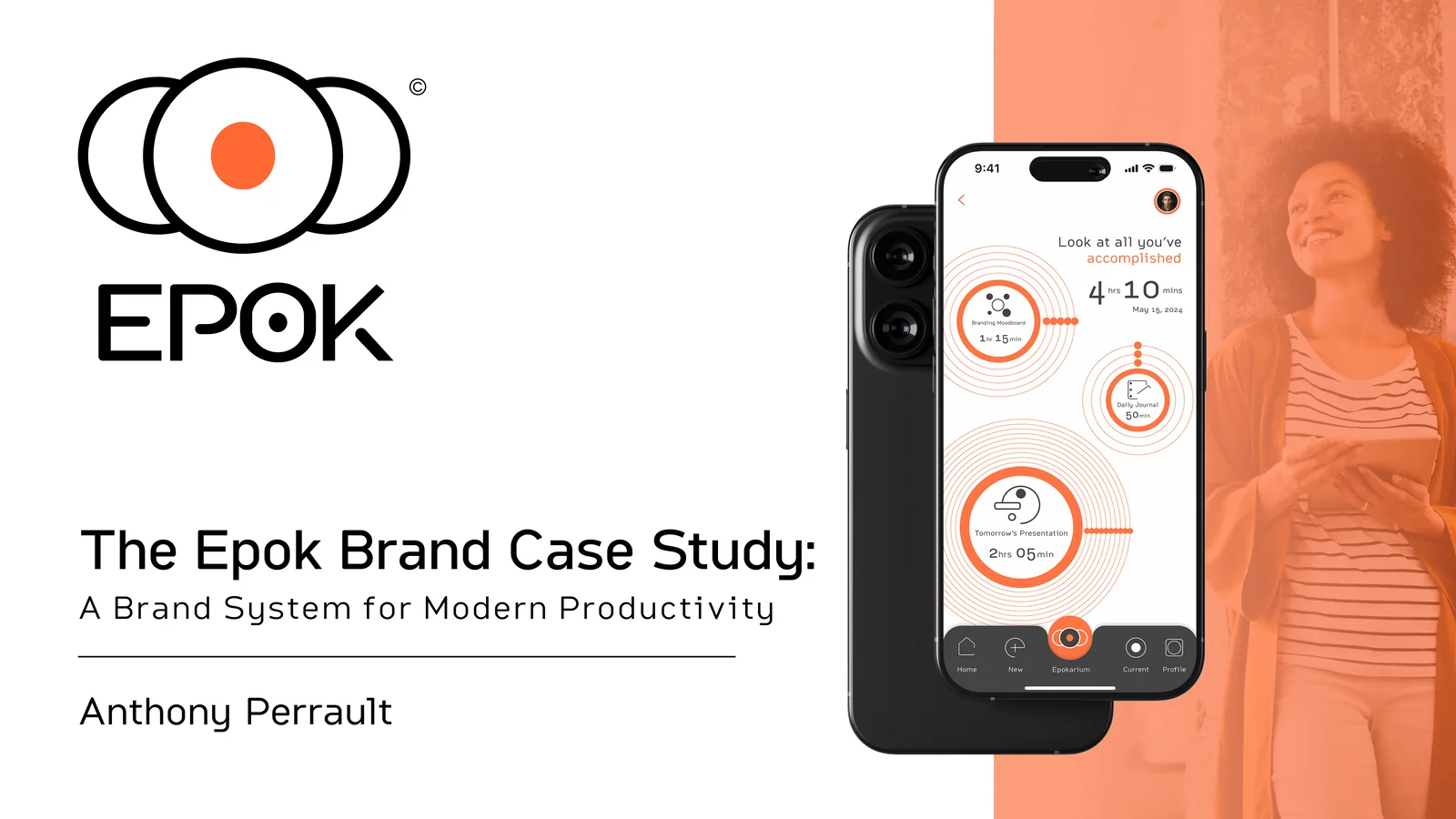
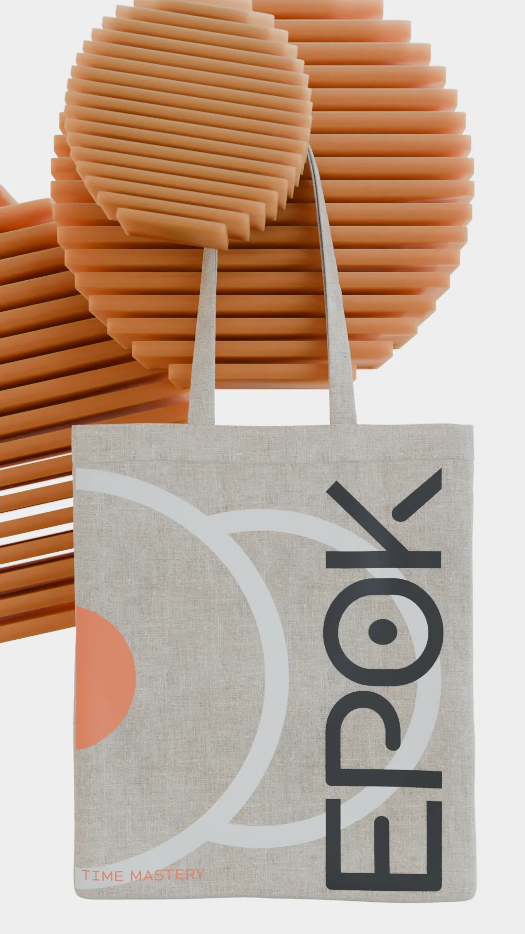
Epok.
A focus app I branded and built.
A focus app I branded and built end to end: one identity, six product screens, and a 3D environment.
What Epok is
Epok is a self-initiated focus app concept, built on the Pomodoro technique. I named it for epoch, a pause and a place to start again, then owned the whole file: the brand identity, six product screens, two decks at 51 pages, and the 3D renders.
I built every finished session to stay on record in the Epokarium, so the work you did is something you can look back at.
- Role
- Brand & product design, end-to-end
- Tools
- Illustrator · After Effects · Photoshop · Blender
- Timeline
- 2024 · self-directed
- Deliverables
- Identity · 6 app screens · 2 decks (26pp + 25pp) · 5 3D renders · 2 watches · 2 environmental
The problem, the mark, and the product
This section covers three steps: the cost of broken focus, the mark I drew and engineered on a grid, and the product screens that run a session.
01 · The problemMy brief named the cost of broken focus: a day of distraction and unstructured remote work, with nothing to show for it.
- DistractionThe hour lost to notifications
- Remote driftNo shape to the working day
- Planning debtA cleared list with no focus behind it
The collage shows two cluttered apps and Epok’s calm timer.

User research shows how a productivity app looks affects whether people choose it and keep using it.
Chose their main productivity app for its visual design.
UserTesting · 2022Abandoned one over cluttered UI.
Nielsen Norman Group · 2020Stay with apps that feel calm.
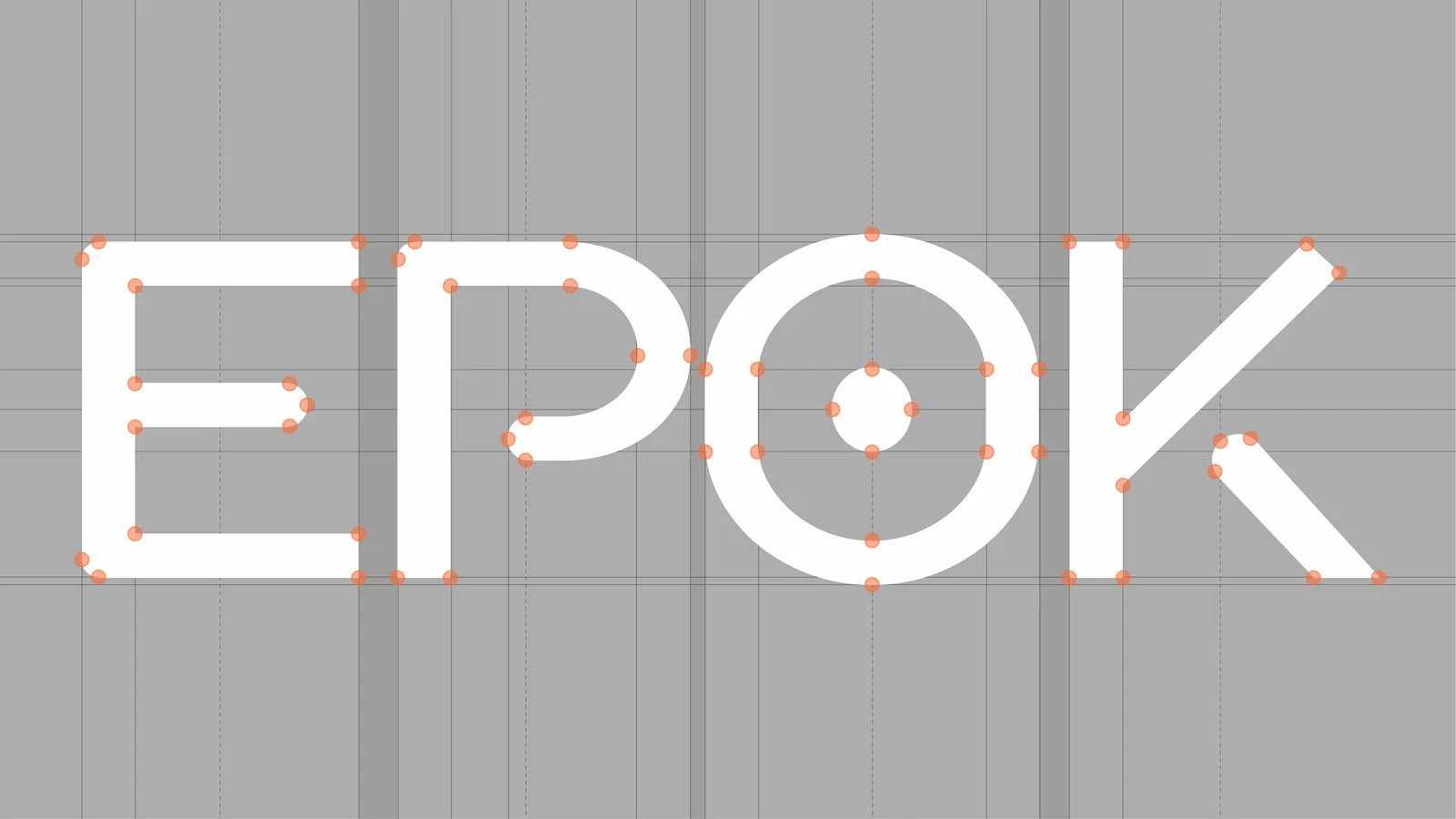
Adobe × Forrester · 2023The mark, drawn by hand then built on a grid
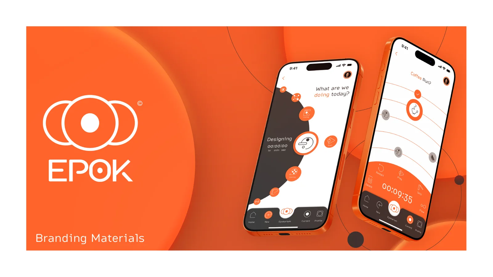
The product screens
Six screens cover one session, from picking the work to reviewing the day. The values below are read off the mockups.
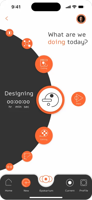
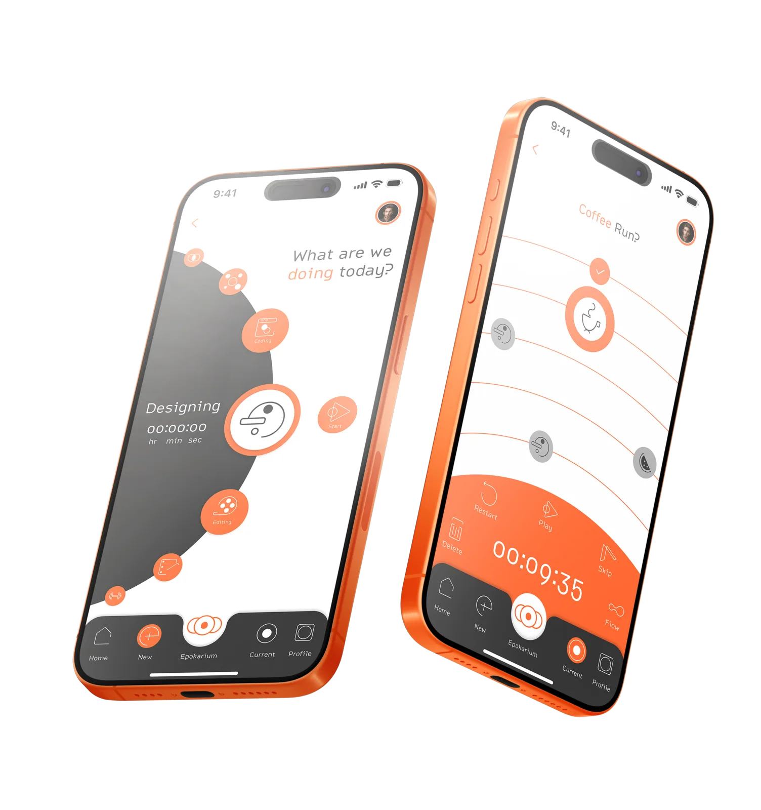
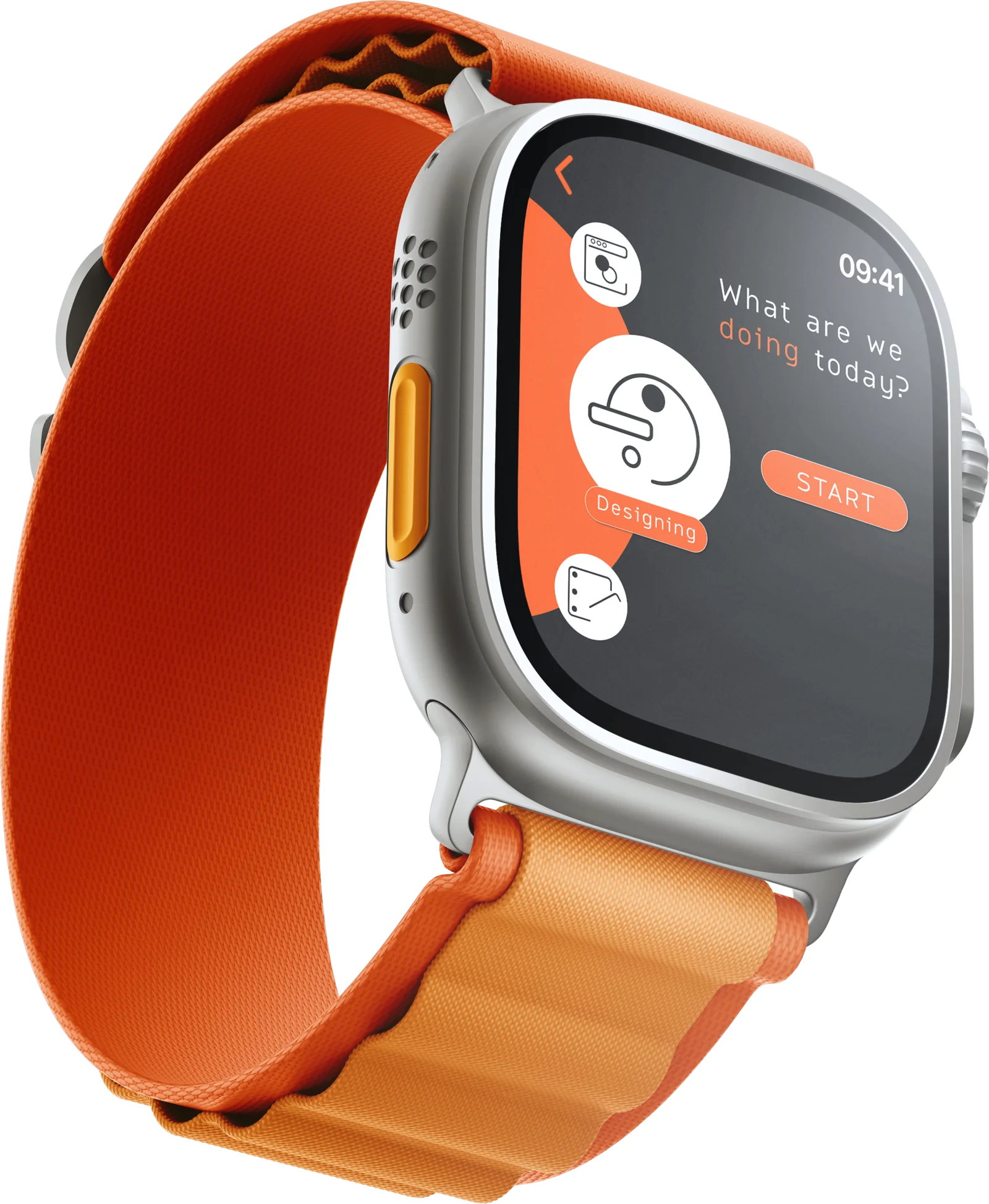
The setup screen
Setup is one screen. The mockup’s categories read Designing, Editing, and Coding, with Start as the single action. These are concept mockups. I gave the setup screen one job: choose the task, then start.
- Categories · 3
- Action · Start
- Screen · session setup
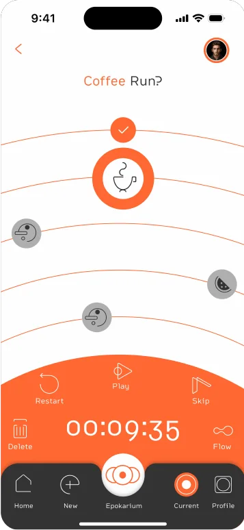
The running timer
The timer runs on an orbital dial. On the mockup it reads 00:09:35 and the active block is labeled Coffee Run. Progress wraps the dial, which holds the elapsed time, the block name, and how much of the session is left.
- Timer · 00:09:35
- Block · Coffee Run
- View · running session
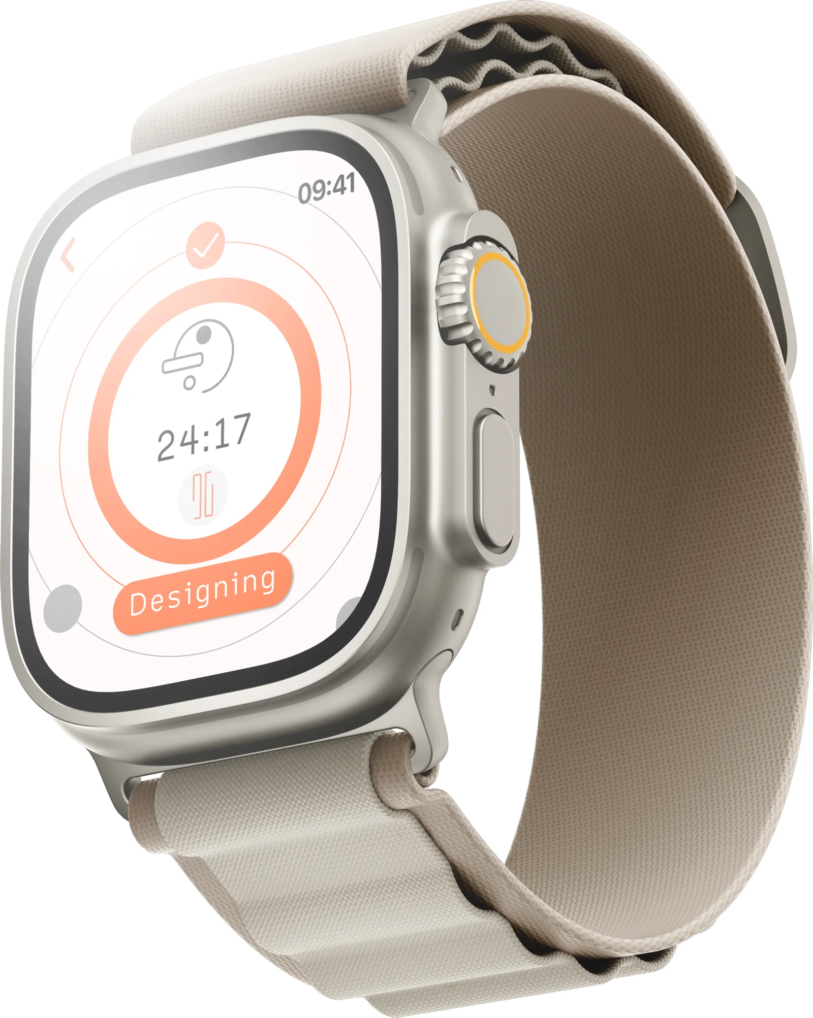
The summary screen
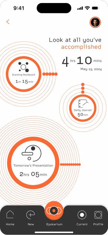
The summary screen totals the day: the mockup shows 4 hrs 10 mins of focus on May 15, 2024. Completed sessions are kept in the Epokarium, where each finished block stays on record as a ring.
- Focus · 4 hrs 10 mins
- Date · May 15, 2024
- View · Epokarium
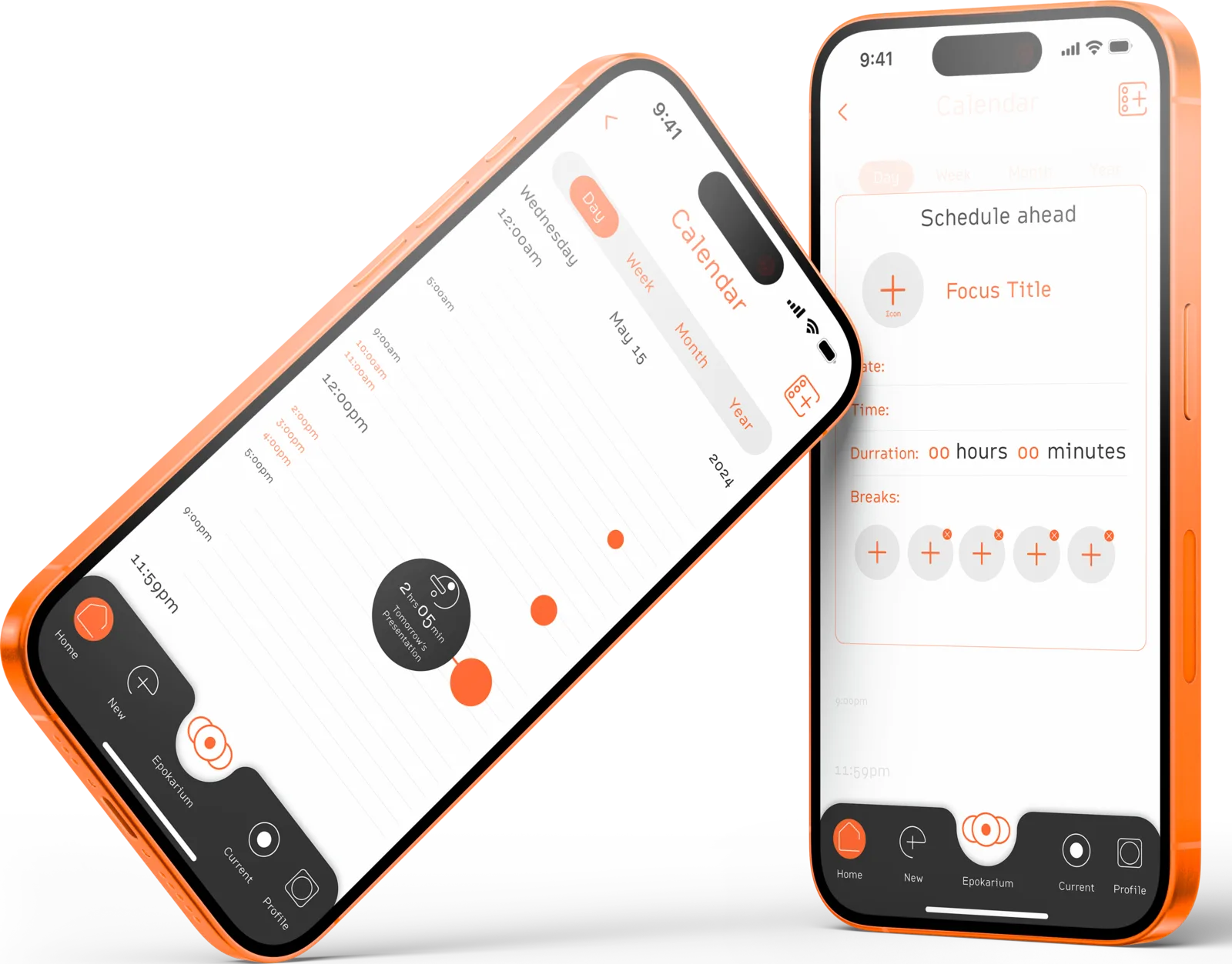
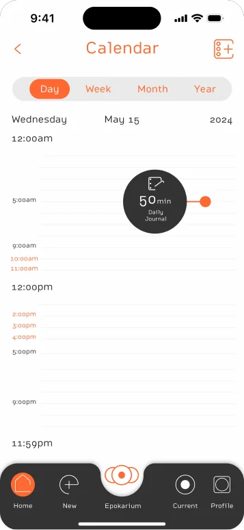
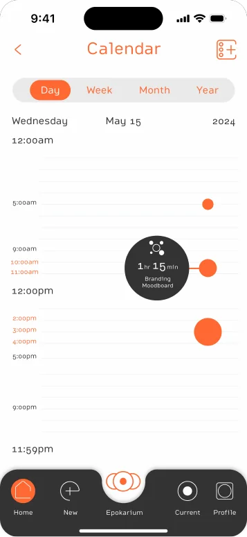
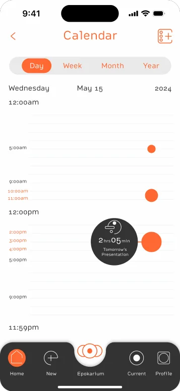
The scheduling screens
I sized the orange sphere to the length of the task: on the calendar a 50-minute journal stays small, a two-hour presentation grows to match.
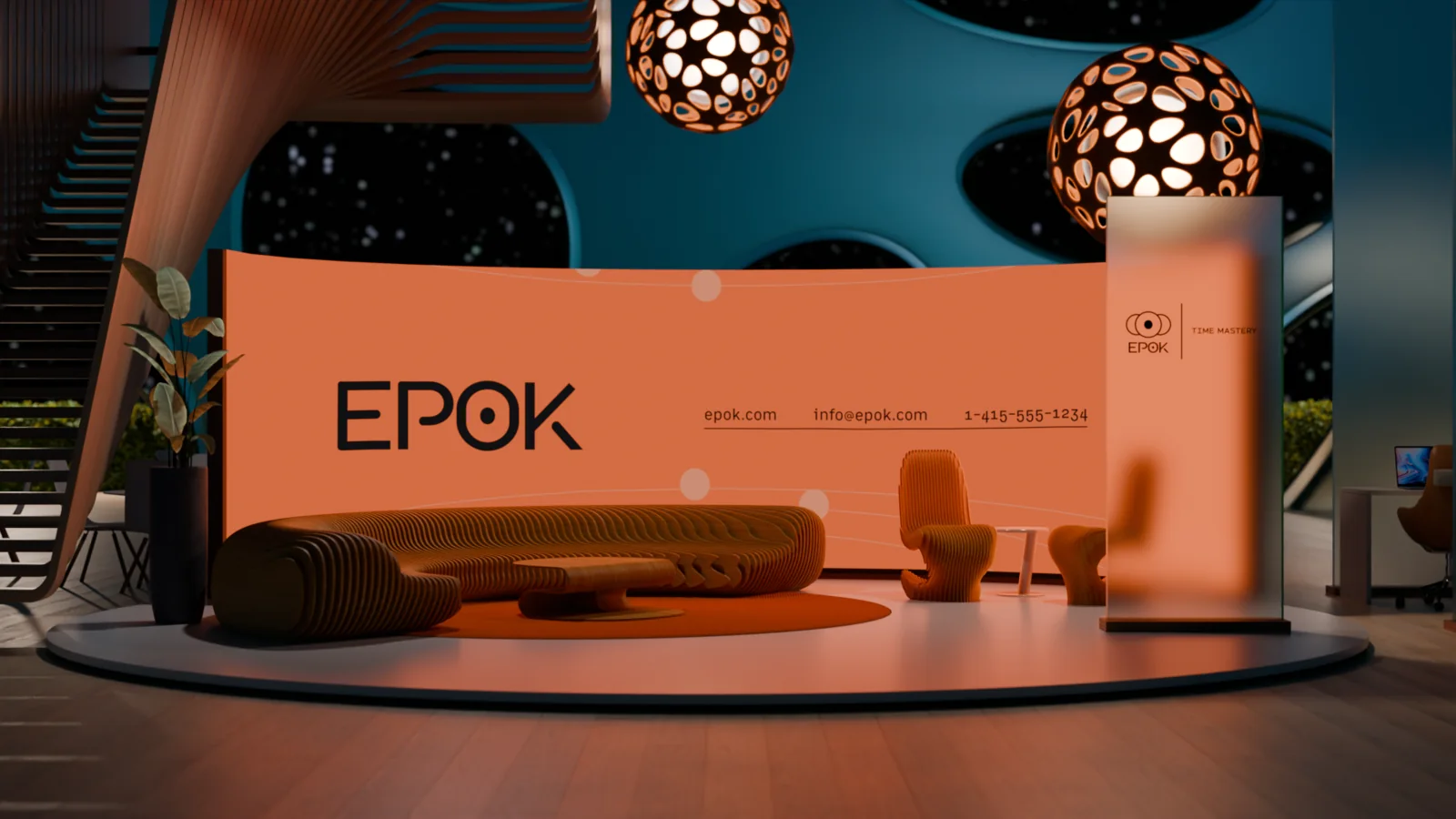
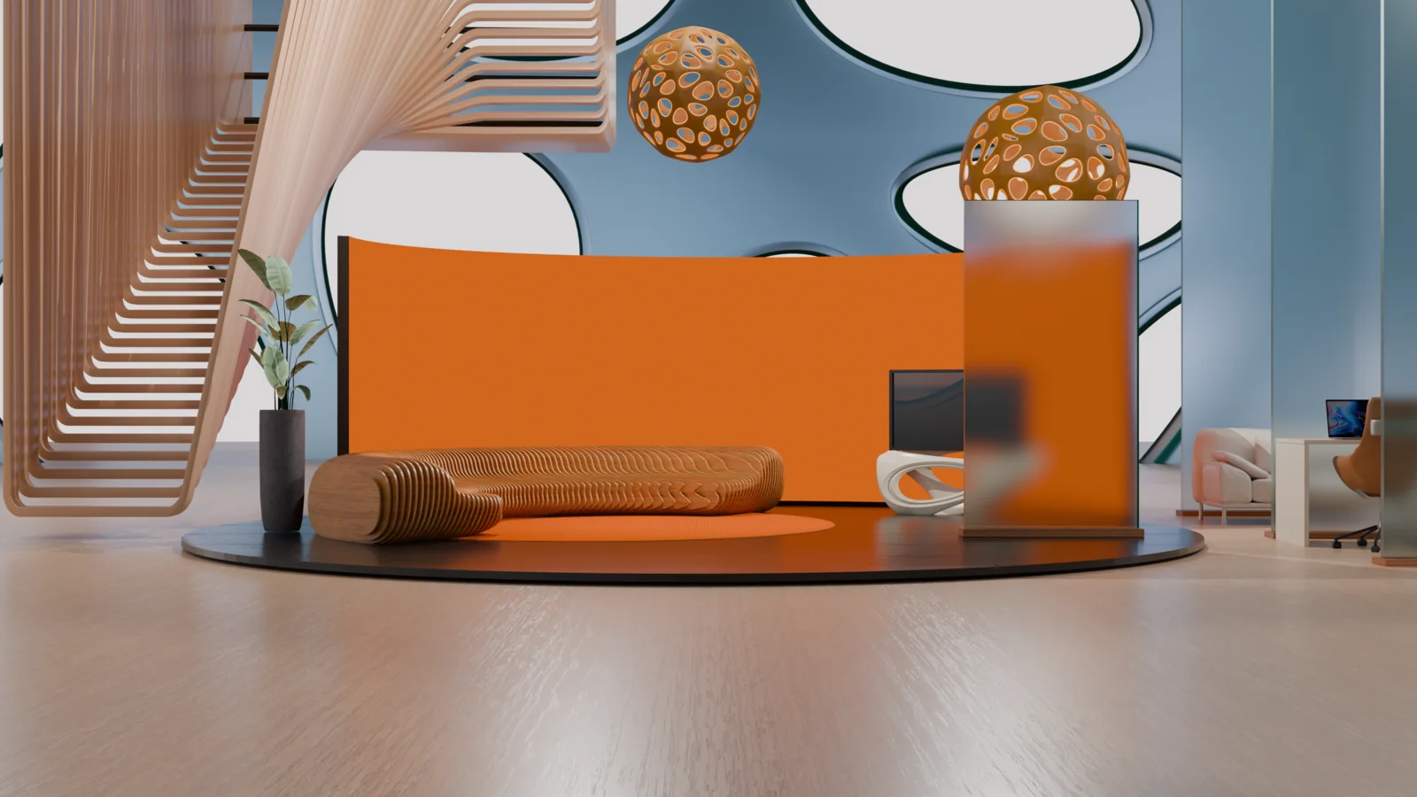
The full case study and the brand guide
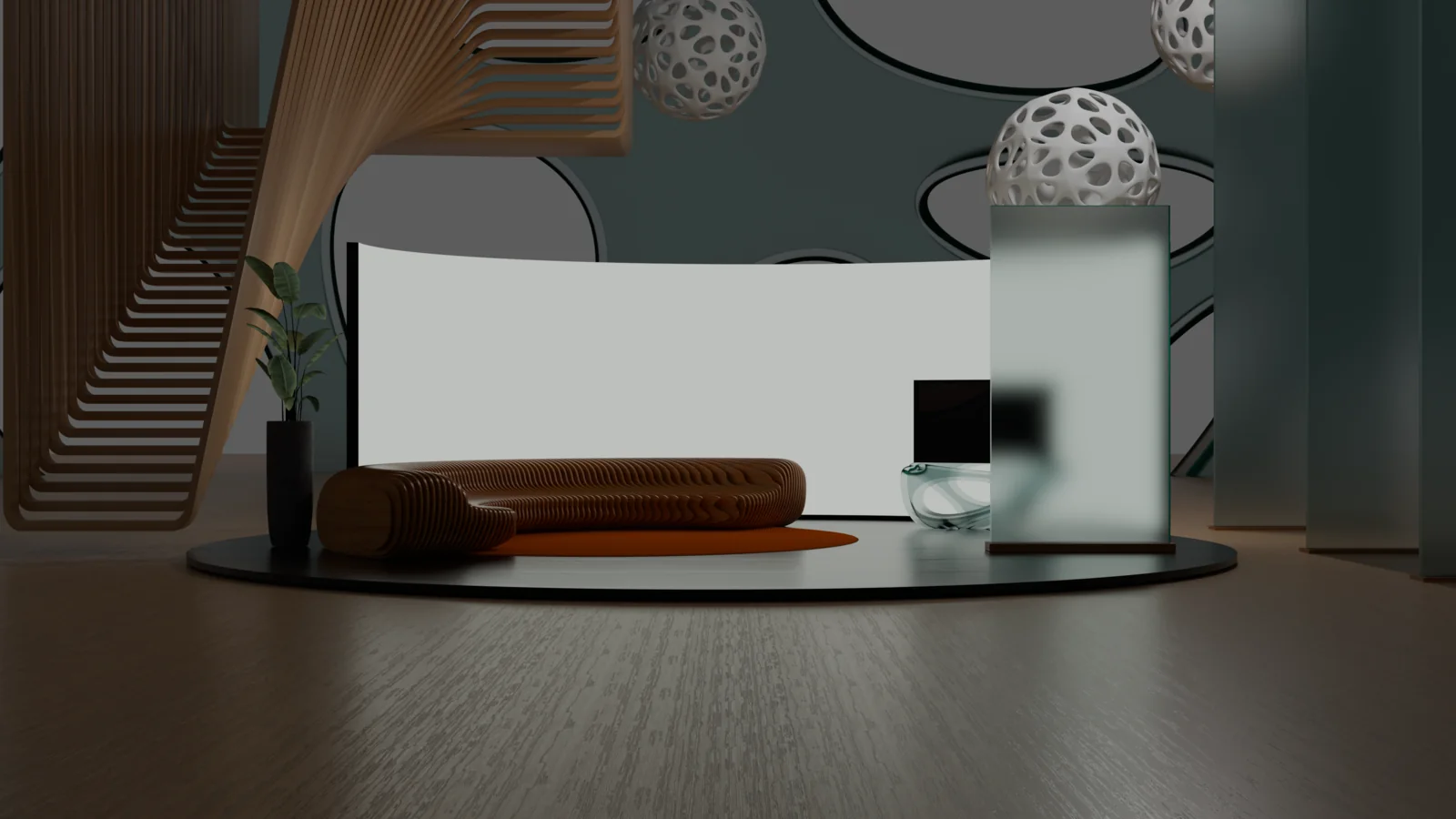
Two decks below: the case-study deck covers the project, the brand-guide deck sets the rules. Then the 3D lobby renders, the object mockups, and the transit campaign.
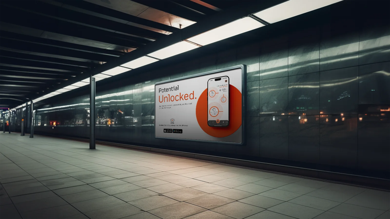 “Potential Unlocked.” · billboard, street scale
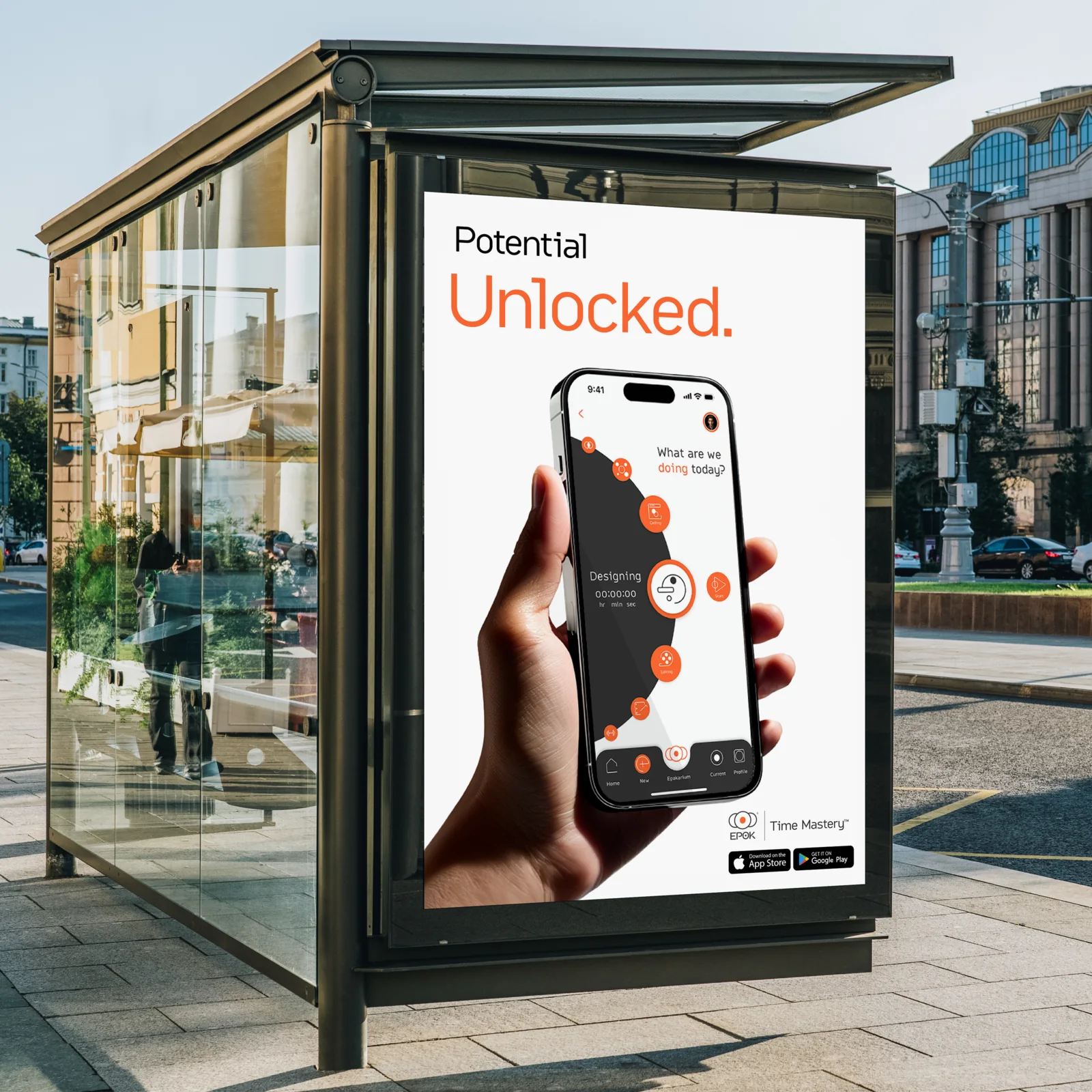
What Epok shows
Epok is the range in one file: I wrote the brief, engineered the mark, mocked the product, and built the lobby in Blender.