Branding for Epok
Epok is a mobile application designed to empower users to effectively conquer their days through structured and focused work sessions, all inspired by the well-known Pomodoro Technique. This innovative tool not only helps individuals manage their time efficiently, but also encourages productivity and concentration throughout their daily tasks.
The Brief
Epok, a productivity app, seeks a brand identity reflecting simplicity, modernity, and inspiration. Targeting professionals and students, the design should evoke "epoch" as a pause and starting point, while maintaining a minimalistic style. The aesthetic should be modern and visually appealing, using a color palette of vibrant orange, bright cream white, graphite black, and optional navy blue. Select a clear sans-serif typeface and design minimal icons, incorporating subtle animations for the logo. Prioritize accessibility with high-contrast colors and a clear visual hierarchy. These guidelines will convey Epok's values and engage its audience effectively.
Tools used
Adobe Illustrator for graphic illustrations and concepts, Adobe After Effects for motion graphics and animation, Adobe Photoshop for real-world branding mockups, Blender 3D for custom interior design and custom mockups

Engaging but simple
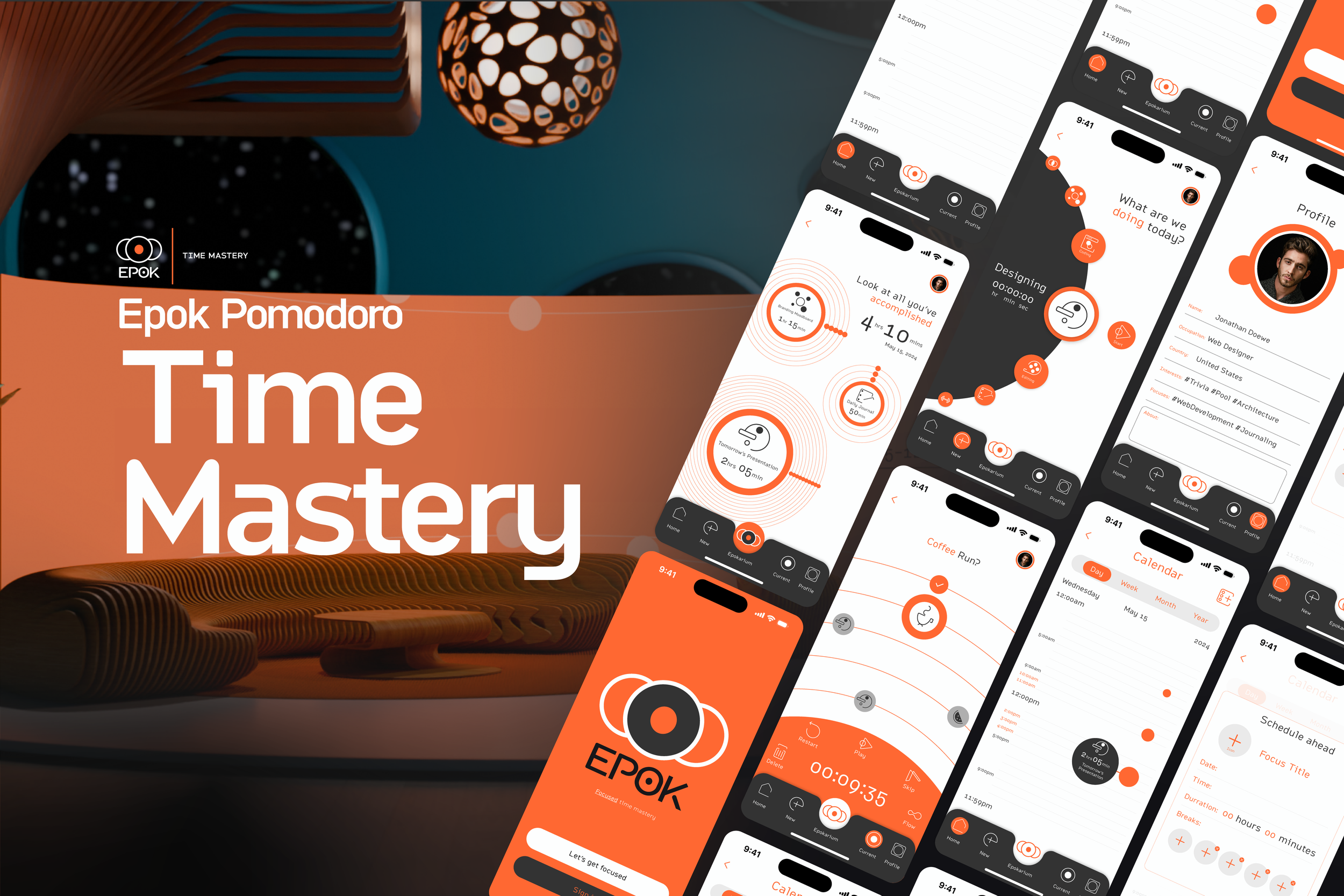
Complete customization of tasks allow you to take full advantage of the proven Pomodoro time keeping method for optimal productivity while minimizing distractions
Focused and concise
Epok’s clear user interface highlights what’s important while giving you a peak into upcoming tasks and time allotments. 
Creative and informative
The unique Epokarium gives you a panoramic perspective on your accomplished tasks and time spent while gamifying time management.Note
Each of the below images within the gallery are expandable with a click. Below the gallery, you’ll find further details on the creative process behind the logo.


